South Dakota Public Broadcasting
Brand IdentityScope of WorkLogo DesignSoundTypographyColorBrand GuideMotionWriting
Project TeamAD: Tom BatesCD: Ted HeerenAE: Heidi MarshPM: Ellen KeenaEditor: Greg KiesowSound: Cory GerlachClient:South Dakota Public Broadcasting is South Dakota's statewide public broadcasting network. SDPB is a vital community resource producing and broadcasting high-quality, commercial-free programs and valuable community outreach projects that educate, enlighten and entertain.
Objective:To better align with listeners and supporters of SDPB, we were tasked to rebrand SDPB with a new visual identity and campaign messaging.
Solution:Our team spent a long time in our branding process, listening to key audience members and evaluating what makes SDPB special and where the opportunities to elevate its position as a trusted news and cultural source.


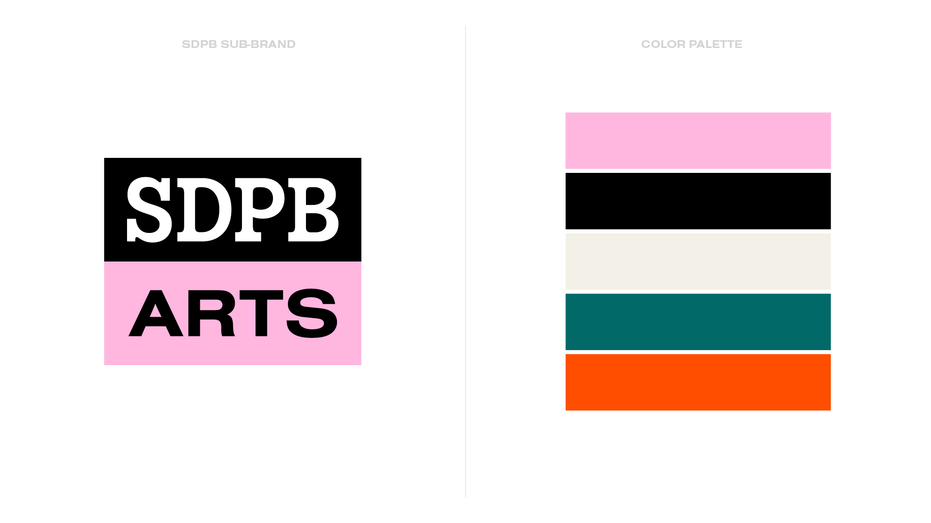
The color palette was derived from important points in South Dakota culture across the state.


The SDPB identity can be expanded into sub-brands, each with its unique color palette, to highlight different facets of South Dakota culture.

The SDPB “P” is an interesting focus. The idea is that “P” (which stands for “Public”) can be replaced with any word or any other version of a “P” that represents an individual listener.


Friends of SDPB advances the mission of South Dakota Public Broadcasting by offering advocacy, leadership, and fundraising that meet the needs of SDPB and all South Dakotans. It also needed a distinct identity aligned with the new SDPB brand.

