Maguire
Brand IdentityProject TeamAgency: Fresh ProduceAD: Tom BatesCD: Ted HeerenAE: Heidi MarshScope of WorkNamingLogo designIdentity SystemLaunch Campaign
Client:Maguire, formerly known as Maguire Iron, serves as a prominent company specializing in the manufacturing and maintenance of water towers. The company's headquarters are situated in Sioux Falls, SD, and it boasts a rich history, having been established in the year 1915.
Objective:Maguire underwent a transformative phase during the construction of their cutting-edge fabrication and corporate office campus located north of town, signifying a shift into a new era. Our collaboration with Maguire involved a name change and the creation of a fresh visual identity, aiming to distinctly position them as industry leaders, setting them apart from competitors, and ensuring their enduring success for years to come.
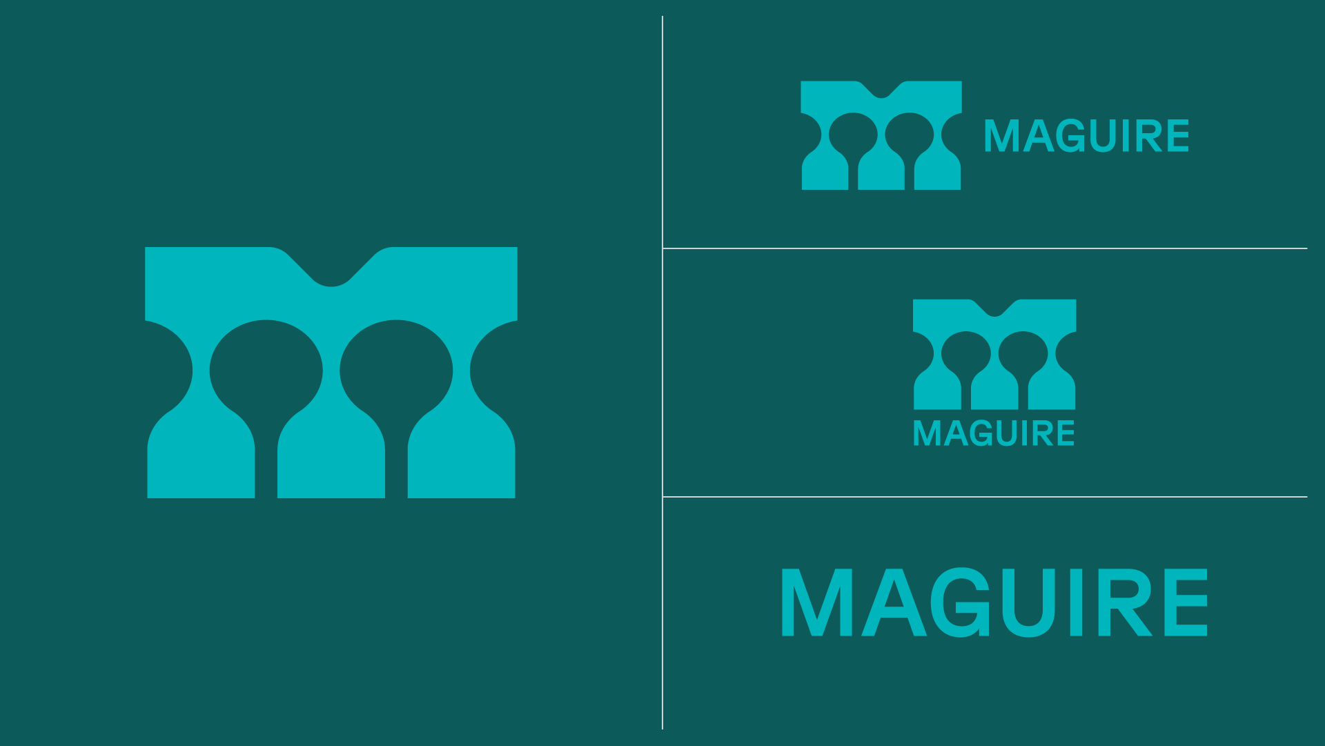
Solution:The enduring association of the Maguire green color prompted the recognition of a need for a distinctive symbol. The M logo was crafted by incorporating a Maguire green rectangle, featuring silhouettes of spheroid water towers in the negative space, forming a robust M. This concept was inspired by the photogenic nature of water towers against the sky backdrop. The identity was further enhanced with the use of Grilli Type’s GT Planar, an industrial yet futuristic typeface known for its longevity. Additionally, a "liquid M" was introduced as a graphic element to complement the logo in various layout compositions. The juxtaposition of two opposing materials, water and steel, provided an intriguing dynamic, lending itself to animation and a flexible identity system.